

Sales Data Plotter Lite
一個簡單的Android應用程序,用於創建相關數據的色彩圖。
應用信息
應用描述
Android應用分析和審查:Sales Data Plotter Lite,由ABHIJIT PODDAR開發。在效率提升類別中列出。當前版本為2.2,在 17/10/2018 上更新。根據用戶在Google Play上的評論:Sales Data Plotter Lite。超過6 千的安裝。 Sales Data Plotter Lite目前有37評論,平均評分為3.9星
you may use the app to plot your data as line or bar graphs.examples of graphs that you may plot :-
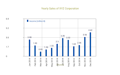
sales figures for a particular product or service for different days in a week, for different days in a month, for different months in a year, for different quarters in a year or for that matter, for different years.
sales figures for up to 31 different products or services in a particular日,月,季度或一年。
銷售主管的個人銷售數字在一周內,一個月的不同日子,一年中的不同幾個月,一年中的不同季度,一年或與此相同的不同年份。您也可以將數據與另一組進行比較。例如,您可以將一個季度不同產品的實際銷售與同一季度的規定目標進行比較。
有關更多信息,請訪問
www.android-apps.abhipss.abhips.com/salesdataplotter/. sales will of you sales will you y your'' : -
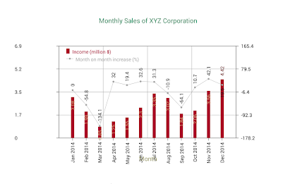
使用輔助Y軸比較原始數據。如果兩組y數據具有不同的性質或具有不同範圍的值,則需要這一點。例如,可以通過使用原始Y軸繪製不同銷售人員的銷售數據來研究促銷活動對產品銷售的有效性,並使用二級Y軸繪製相應銷售的百分比增加或減少。
對銷售數據執行簡單的統計信息,以查找總銷售額,平均銷售,與平均水平的標準偏差等。例如,統計數據可以幫助指出促銷活動對銷售的有效性。它們也可以顯示在圖形畫布上。
將圖形畫布放大到不同尺寸,以便能夠更詳細地查看圖形。事實證明,隨著數據的增加數量的增加。
保存高分辨率在屏幕上圖像(原始或縮放尺寸)以及所有數據以及所有數據到手機內存或SD卡,以在全尺寸的紙張上進行打印出來,或者在計算機上或將其與LCD投影器一起顯示,並將其與您的lcd Projector一起顯示。
安裝後,該應用程序不需要保持連接到Internet,除非您要使用它來訪問“銷售數據繪圖器”網站。
該應用程序是由: -
DR創建。 Abhijit Poddar
部。 Electronic Sc。 monali poddar
dept。計算機SC。
Maharaja Manindra Chandra College
Kolkata 700003印度
我們目前正在提供2.2版本。這是我們最新,最優化的版本。它適用於許多不同的設備。從Google Play商店或我們託管的其他版本中免費下載Apk。此外,您可以在不註冊的情況下下載且無需登錄。
我們擁有超過2000+的Samsung, Xiaomi, Huawei, Oppo, Vivo, Motorola, LG, Google, OnePlus, Sony, Tablet ...設備,並提供了許多選項,您可以輕鬆選擇適合您設備的遊戲或軟件。
如果在Google App Store上有任何國家限製或設備側面受到任何限制,它可能會派上用場。
什麼是新的
Bugs removed


